ENECO
building trust and conversion through redesigning the SME homepage & calculation tool
A homepage that didn’t convert or connect
Eneco SME with a client base of 324.000 clients offered energy solutions and services.
Through low conversion rates, there was a need for understanding where this problem comes from to up these numbers. In meetings with stakeholders it was clear that the website had not been tested outside of mainly quantitative testing through software like Hotjar and A/B testing methods. Because of this there was no understanding of what users actually need.
accomplishments
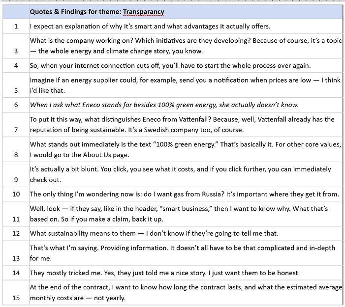
INFLUENCED LASTING CHANGES ON THE ENECO WEBSITE
FOCUS ON USER-DRIVEN INSIGHTS
IDENTIFIED UNMET USER NEEDS
DESIGNED TO TRUST & BE TRANSPARANT
What users revealed: A need for clarity and trust
The assumption about misaligned user needs became my north star. I chose to investigate it directly by speaking to the people the site was meant to serve. This decision completely reframed the project. Instead of focusing on surface-level fixes, I initiated semi-structured interviews with entrepreneurs from our target group. This revealed more than missing features, it revealed missing clarity. Users skipped content, misunderstood Eneco’s mission, and often couldn’t explain what the company even stood for. Also was entering your IBAN too much of a commitment and felt ‘scary’ to most users.
Two recurring needs emerged loud and clear: transparency and trust. These weren’t just themes, they were pain points. Information about pricing, benefits, and sustainability was either hidden, unclear, or missing entirely. Transparency and trust became the foundation for everything that followed. From design decisions to testing strategies.
The process: Co-creating with users
One of the most important choices I made was to abandon the idea of a “quick fix.” Instead, I shifted to designing with users, continuously validating ideas through feedback rounds, and testing not only for usability, but for the deeper experience of perceived transparency. Even the test method evolved into a custom approach I called “Honeycomb Experience Testing,” rooted in the UX Honeycomb by Peter Morville. I tested the design to every item in the honeycomb. To this day the Eneco website shares a foundation with the solution I created in this project.
The outcome: Clarity as a feature, transparency as strategy
I translated the insights into “How Might We” questions to spark ideation and backed this with desk research on designing for transparency. Interview findings stayed at the core of the solution.
In user tests based on the UX Honeycomb, I focused on perceived clarity. Not by asking directly, but by observing and prompting users to think aloud.
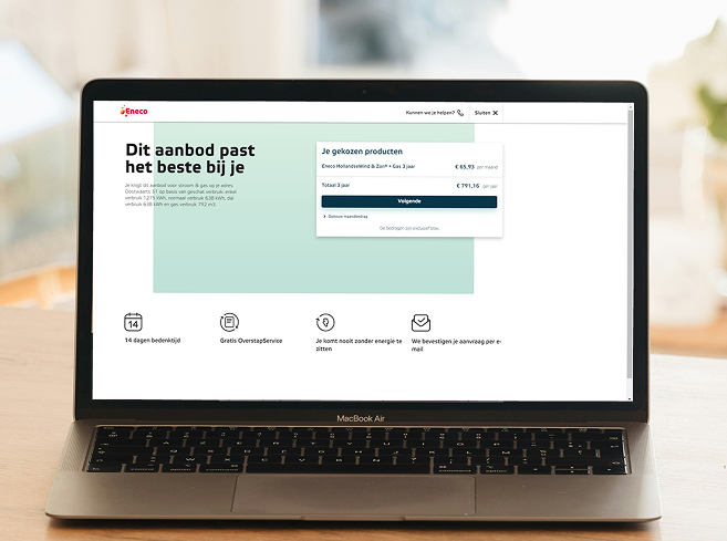
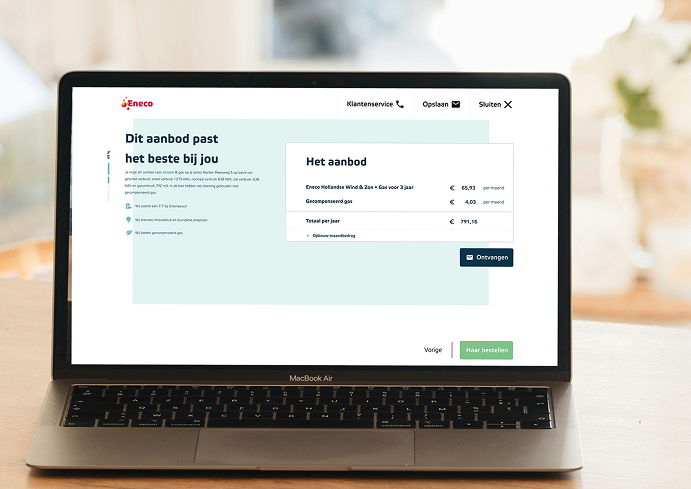
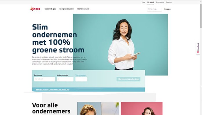
The redesign removed friction: no more entering IBANs. Users could now email themselves a quote. A “Save Progress” option added convenience, and the homepage featured icon-based info cards highlighting Eneco’s benefits in digestible chunks.
Follow-up A/B testing helped refine these changes. The outcome? A clearer, more trustworthy user experience rooted in real needs, not assumptions, as can be seen below.
Video Essay:
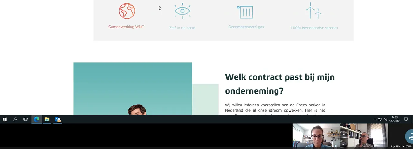
You can watch my Video Essay here (in Dutch) for a clear rapport on every change.
Process: The most important changes and why
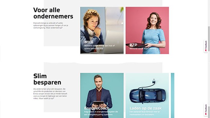
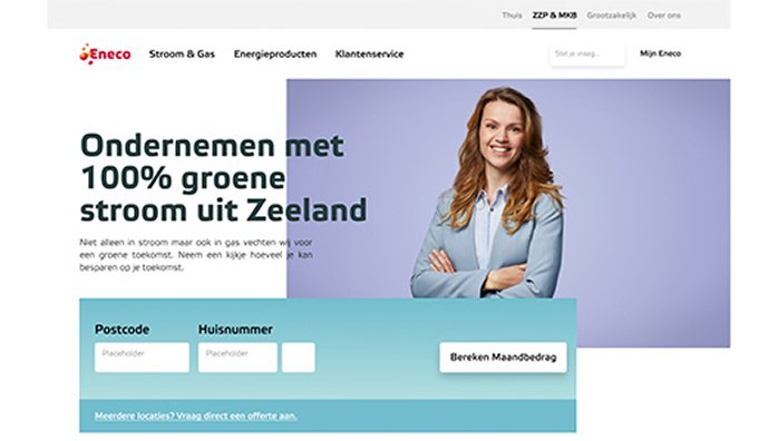
The Hero. The hero section is placed at the top of the homepage to boost conversion. Users are naturally drawn to click on it, as confirmed by both Hotjar data and interviews.
The header follows Cialdini’s Unity principle, creating a sense of shared identity that appeals to the entrepreneurial mindset (“if you support me, I support you”) that came from the interviews.
A different image comes from the fact that ‘stroom & gas’ and home had the same colour image, so to give a clear difference, this was changed.
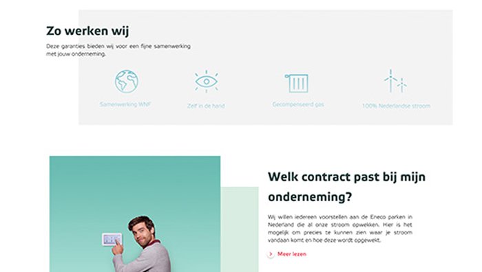
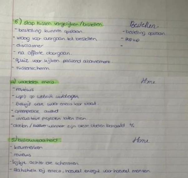
How We Work & Which Subscription
I chose to place the content related to one of the concepts as the first block. Interviews, user needs, and the Customer Journey Map (CJM) all highlighted that users highly value clear information about products and subscriptions. Information that is currently difficult to find on the website.
According to the CJM, this need even carries above-average priority. In the current Eneco homepage, a ‘How We Work’ section sits at the top with additional justification.