REWORC
increasing response rates by designing a survey tool system through understanding current problematic tool usage
A survey that gathered frustration instead of insight.
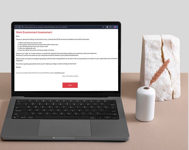
Reworc helps large organizations understand their employees’ needs. These insights are gathered through a company-wide survey, primarily used by HR and FM professionals.
The need for a new survey experience began when changes to an external tool disrupted the data-gathering process, but this revealed deeper issues. The original tool required participants to perform mental calculations, wasn’t accessible (WCAG), and often led to confusion – people didn’t fully read questions, felt restricted in responding and many dropped off before finishing. Although crucial for data collection, the survey had a 55% response rate and could take up to 23 minutes.
This was an opportunity not just to replace the tool, but to rethink the experience. By cutting complexity and introducing logic in branched questions to make participation feel lighter and more intuitive.
accomplishments
RESPONSE RATE UP BY 20%
TIME TO COMPLETE SURVEY DOWN BY 44%
WCAG COMPLIANT
INTUITIVE AND INCREASED FEELING OF FREEDOM
What users needed: A need for less cognitive load and a feeling of freedom
I analysed three years of user feedback to identify recurring themes. To deepen these insights, I conducted observational interviews with participants from diverse backgrounds as they completed the survey. This helped validate and expand on the existing feedback, revealing smaller but meaningful friction points that had gone unreported. Some of the themes identified related to the length and the cognitive load caused by the mathematical content.
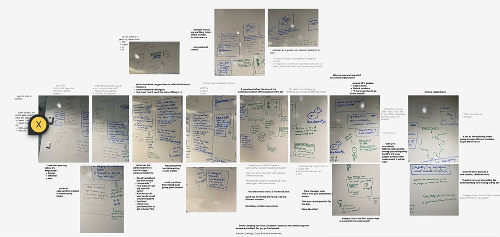
The concept phase: Wild ideas, grounded design
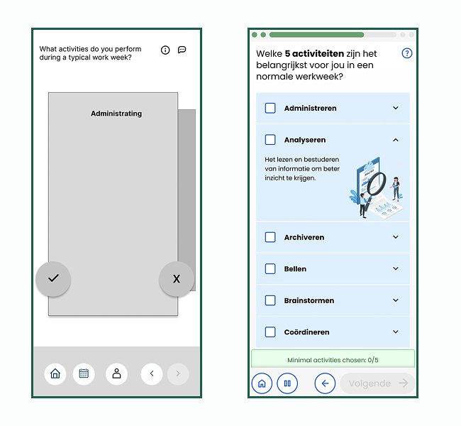
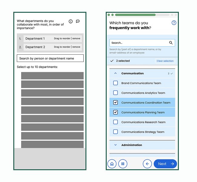
I ran a “wild ideas” brainstorm together with stakeholders to share long-held ideas. After surfacing everything, we revisited the user needs and narrowed down concepts that were both impactful and feasible within time and technical constraints. I audited the types of questions in the survey. Radio buttons, checkboxes, sliders, Likert scales and created a sitemap to understand how branched logic connected across six modules. Sketching helped us explore how to simplify complex flows, and also revealed awkward phrasing in some questions. For example, we replaced confusing terms like “spontaneous conversation complexity” with more natural language.
The outcome: Designing for freedom, not mathematics fanatics
Wireframing started with a mobile-first approach to ensure the survey could be used anywhere, anytime. Since WCAG compliance was essential, I collaborated closely with developers to clarify accessibility responsibilities and build inclusive design from the start.
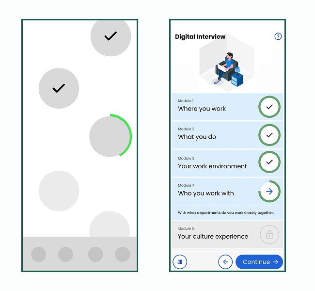
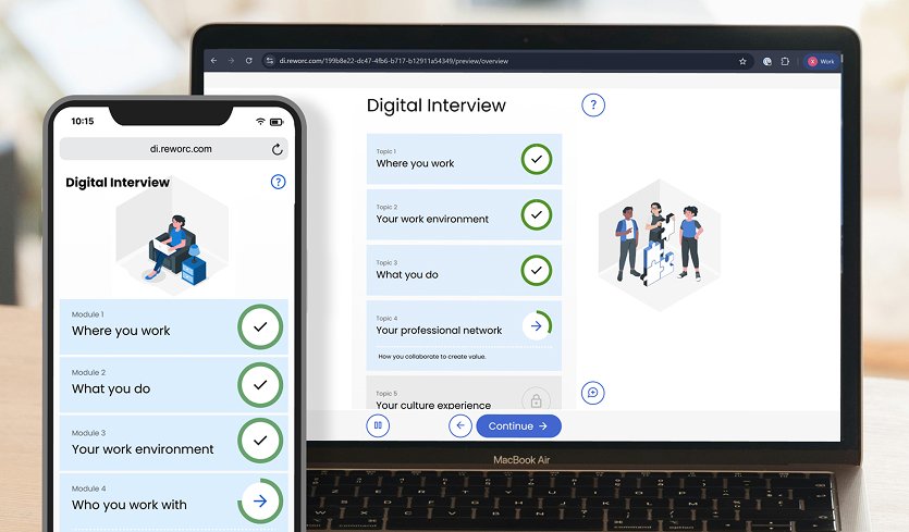
During early wireframe testing, icon clarity was explored, interaction patterns, and accessibility pain points. Also was found that in the original system, data would only be used whenever completion was 100% across all modules. We created a way where whenever a module was completed, it was able to be used already.
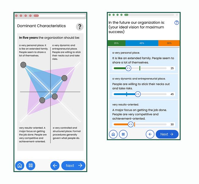
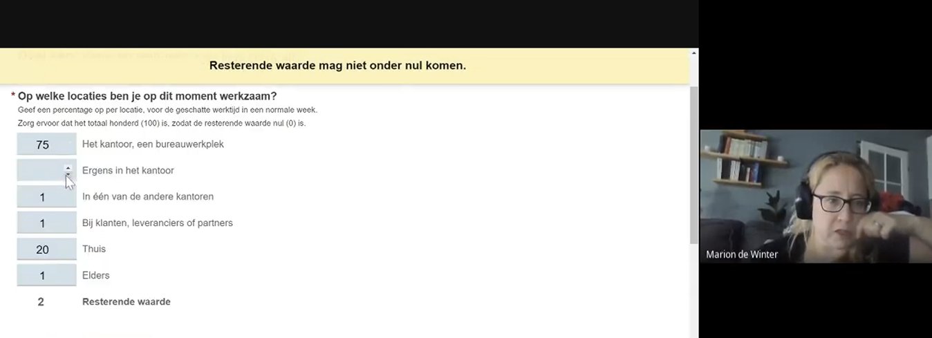
High-fidelity mock-ups that that took WCAG standards into account were delivered. Including a custom slider system that allowed users to freely assign values, with automatic balancing to 100%. This design gave users a sense of control while eliminating the need for mental calculation. One of the most common pain points in the original experience.
After release: Expanding into Product Ownership
As the project neared completion, my role naturally evolved beyond UX. I began prioritizing tasks based on feedback by users, clarifying technical handoffs, and aligning the team and scope. This transition helped ensure continuity between design intent and delivery.
You can check the Digital Interview Demo here for yourself.